The Warning Screen That Was Scaring People Away
Every Indigo-Nx tool ships with a warning screen before it launches.
It's a shared component — one file, dropped into every project, called before the app initialises. The idea is sound: set expectations upfront, make it clear this is independent software with no support contract, and let people decide if they're in before committing.
The problem was the tone.
What It Said
The original centrepiece line was:
// FUCK AROUND AND FIND OUT //
↑ this is where it went wrongAmber. Monospace. Bold. Hard to miss.
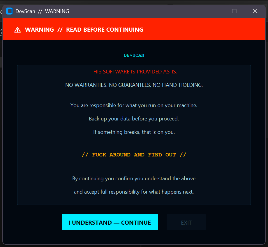
And honestly, for internal tooling? Fine. For tools shared publicly on GitHub? Not great. GitHub's terms of service don't allow explicit content in public repositories, which means that line was a compliance problem sitting in the middle of every release.
But the bigger issue wasn't the rules — it was the message it sent. These tools are built to be useful. DevScan helps people explore USB hardware. ViewShift solves a real problem with display management. The X52 configurator fills a gap left by abandoned vendor software. None of that is dangerous. None of it needs a threat.
The warning screen was set up to protect us from users. It should have been set up to welcome them.
What It Became
The brief: keep the aesthetic, tone it down, stay cheeky, don't scare people off.
A few iterations.
First pass just cleaned up the language — "no hand-holding" became "no support contract", the explicit line became // CURIOSITY REWARDED. CARELESSNESS LESS SO. //. Better, but still had the same defensive energy. The header bar was red. The first line was highlighted in red. Everything about it said danger.
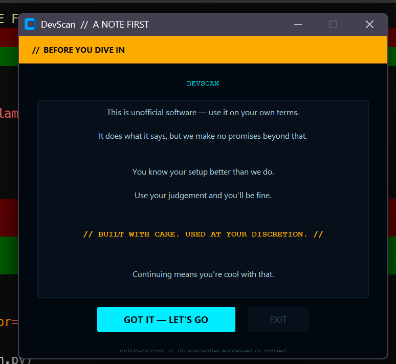
Second pass changed the posture entirely:
This is unofficial software — use it on your own terms.
It does what it says, but we make no promises beyond that.

You know your setup better than we do.
Use your judgement and you'll be fine.

// BUILT WITH CARE. USED AT YOUR DISCRETION. //

Continuing means you're cool with that.
The header went from red to amber. "WARNING" became "BEFORE YOU DIVE IN". The confirm button changed from I UNDERSTAND — CONTINUE to GOT IT — LET'S GO.
Same aesthetic. Same monospace centrepiece. No aggression.
The Size Problem
The original window was 600×520. Too big — it dominated the screen and made the whole thing feel more serious than it needed to.
Brought it down to 480×420. Compact, centred, doesn't loom. Enough space for the content without the theatrical scale.
The Shared Component
The warning screen lives at shared/warning_screen.py. Every project that ships a release imports it:
import sys
from pathlib import Path
sys.path.insert(0, str(Path(__file__).parent.parent / "shared"))
from warning_screen import show_warning

if not show_warning("DevScan"):
    sys.exit(0)
One file. One update. Every tool gets it.
The rule hasn't changed — every release gets the screen, no exceptions. What changed is what the screen says.
What It's Actually For
A disclaimer screen before a tool launches exists for one reason: to make sure the person running it knows what they're running.
That's it. Not to scare them. Not to protect the author from legal action. Not to perform seriousness. Just to say: here's what this is, here's who made it, here's the deal.
"Use your judgement and you'll be fine" is more honest than "NO WARRANTIES. NO GUARANTEES." — and it's a better first impression of the tools behind it.
Build with care. Let the work do the talking.